John Carter Brown Library 2023
A first-of-its-kind collaborative research platform for indigenous and colonial histories
European Design Award Finalist · Featured on Dutch Digital Design


Indigenous and colonial histories deserve a wider audience, but much of this knowledge remained locked in archives. The John Carter Brown Library, a leading institution in early American history, set out to change that. With 65,000 digitized objects, they needed more than just a searchable database. They wanted a platform where scholars could research, collaborate, and turn their findings into interactive exhibitions.
My role
I was part of the team that built that platform for scholars. I led the UX and interaction design and later in the process co-designed the UI components. Let's take a look.
Collaborative creation
Academic research is all about collaboration, so we designed the Collaboratory: a place where researchers can start projects. Projects are collaborative spaces where researchers can work together. Here they can save annotated objects from the collection, develop their insights, and eventually share their findings with the world.

As a project creator, managing collaborators in a project is straightforward. Invited researchers receive an email that allows them to join.
Show me what I need when I need it
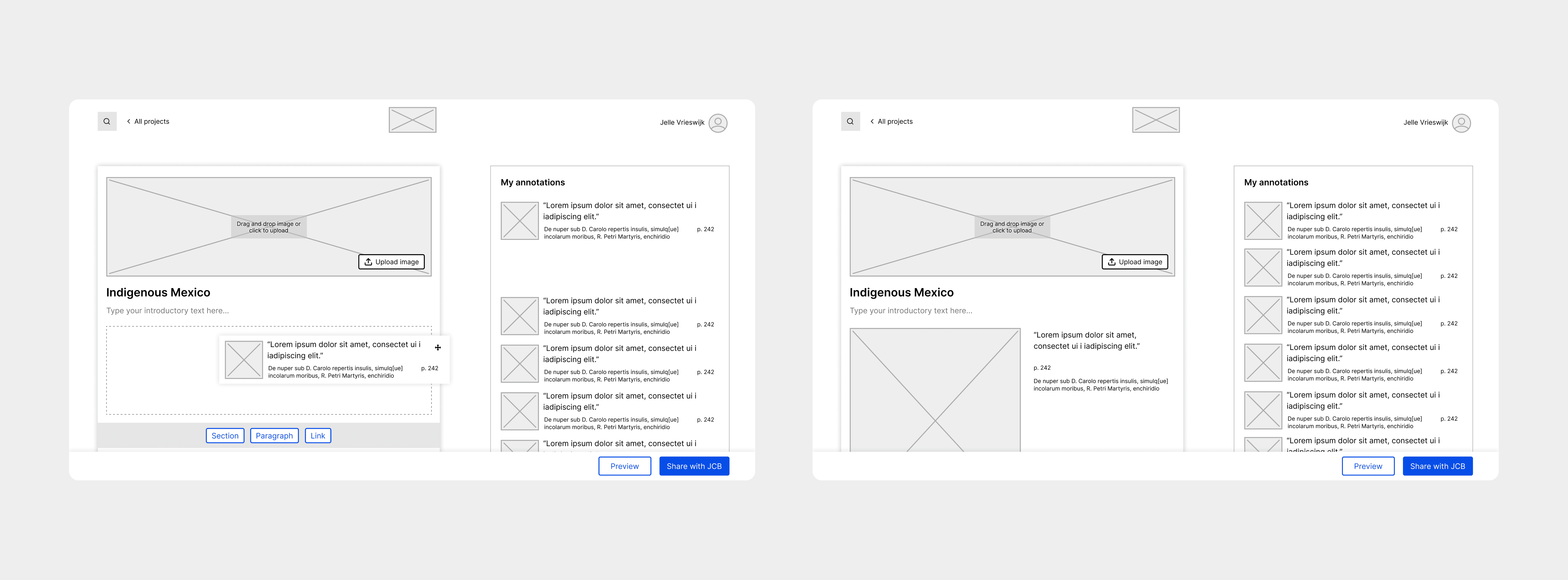
Projects aren’t static collections of annotated objects, it's also the place to create exhibitions. To keep the interface uncluttered, I applied the “Show me what I need when I need it” principle: interactions should appear only when relevant. I designed a drag-and-drop interface that lets users easily rearrange items, with contextual options for adding sections or editing titles appearing on hover. Every change syncs in real time, ensuring all collaborators are always in the loop.
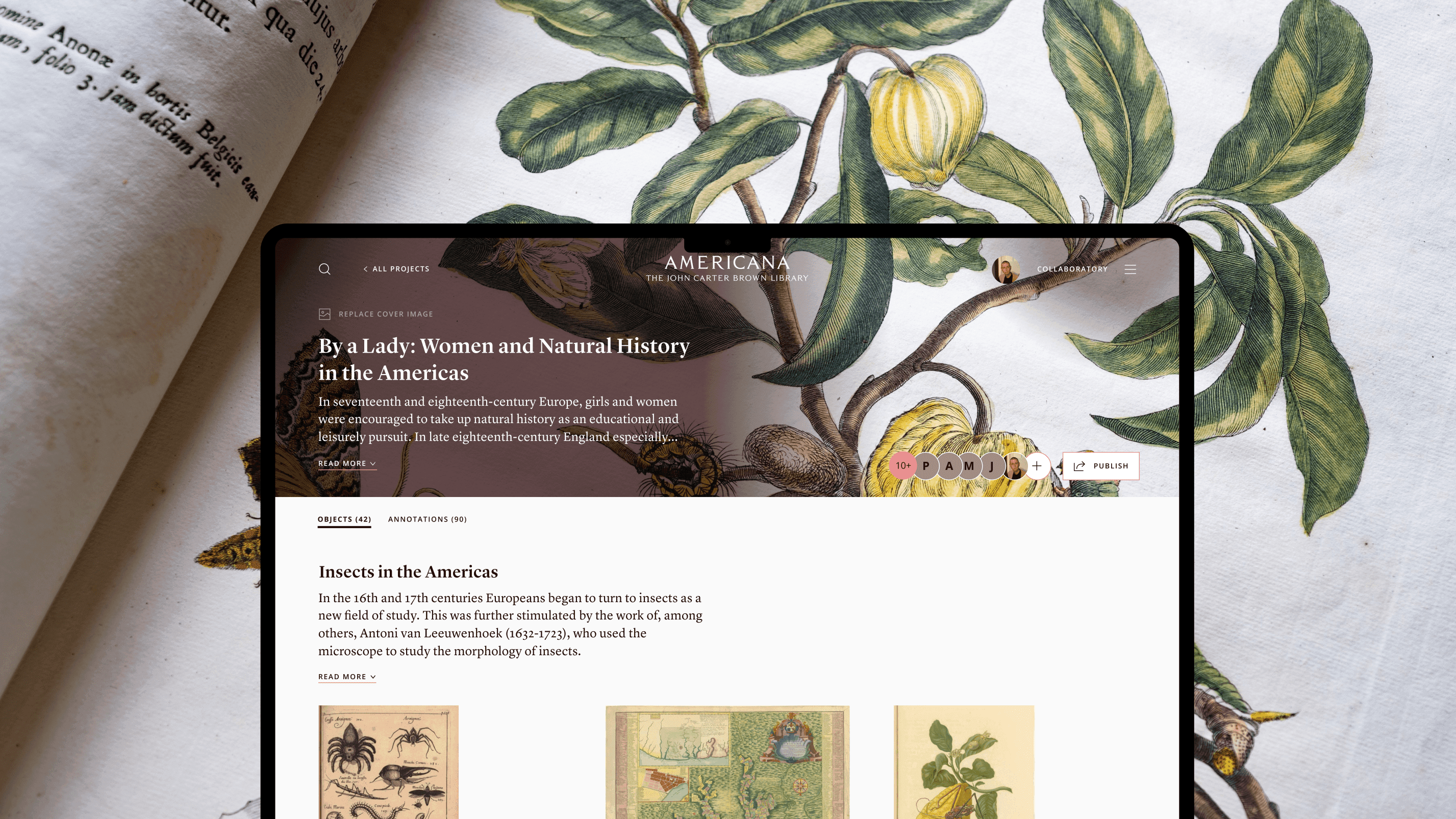

Effortless publishing
When researchers or teams are ready to publish, they can hit the publish button but because exhibitions often cover sensitive historical topics, they require approval first. To make this process smooth, I designed a review system with clear status updates and email notifications, keeping publishers informed at every step.
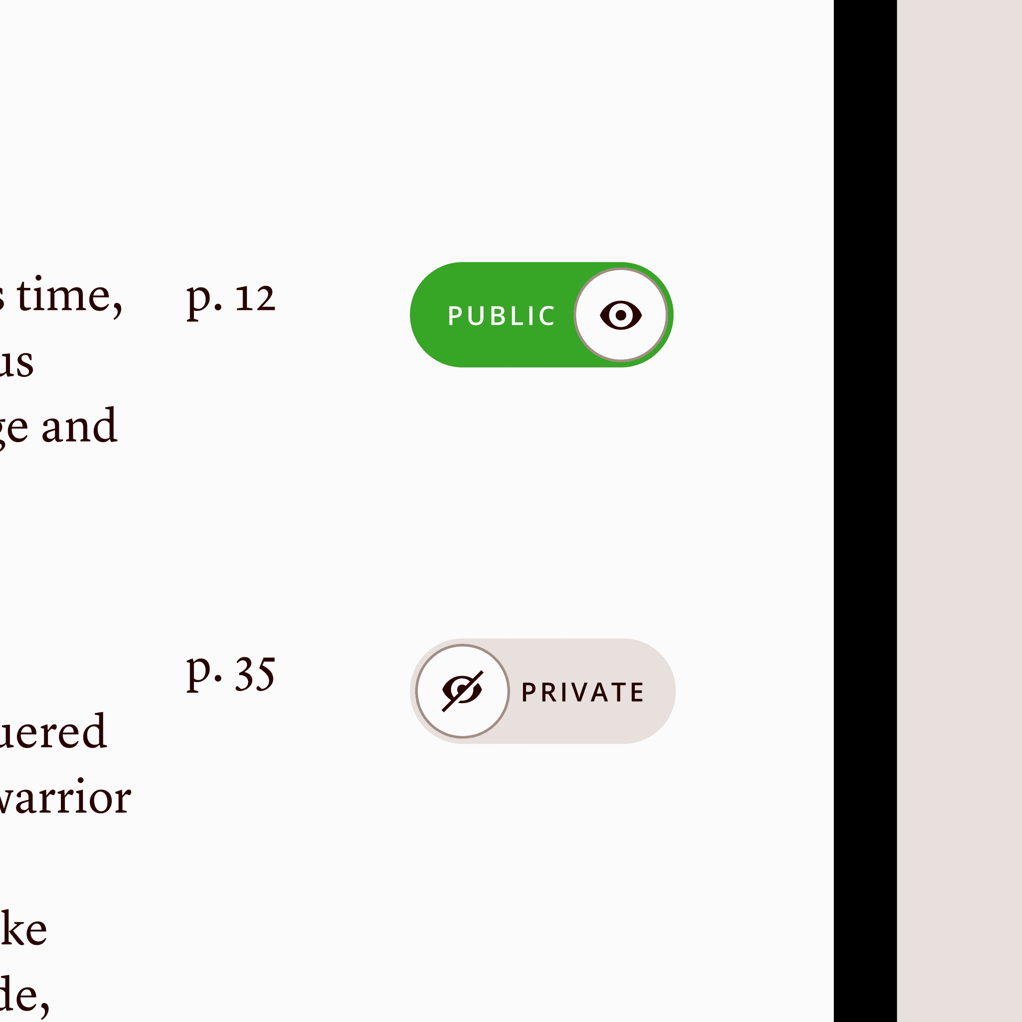

If researchers don't want to include annotations in their exhibition they can set them to 'Private'.
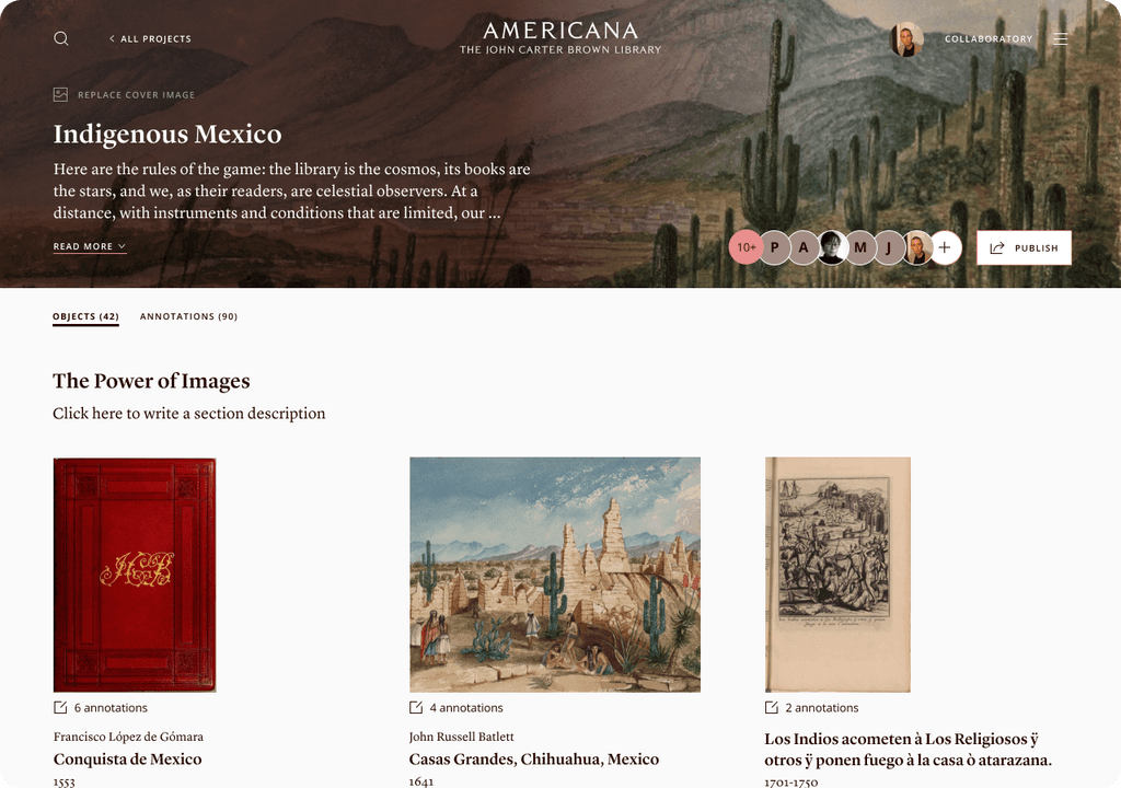
Bringing exhibitions to life
Exhibitions turn research into immersive experiences. Our design lets viewers zoom into annotated details, offering a closer look at historical artifacts. While optimized for desktop research, I designed the mobile experience ensuring historical narratives are equally engaging.
Context
Setting the stage
Before Americana took shape, a lot had already happened. In 2021, the John Carter Brown Library kicked off an initiative called Welcome and Access to make both the physical library and its digital presence accessible to everyone. At that point, another team from my agency got involved.
Building on earlier foundations
That early team laid the groundwork by conducting a thorough discovery and research phase and by unifying the library’s digital collections onto a single platform. This pre-Americana platform allowed users to browse the collection and save objects to projects. During the second phase I had the opportunity to design and build upon those foundations.
A self-steering dream team
I was part of a six-member team that included a visual designer, a front-end developer, two back-end developers, and our client Pedro, who served as product owner. We worked closely together, making decisions collectively. As there was no project manager the visual designer and I took on that role together.

We kept the scrum board updated and continuously adapted priorities based on new insights.
Designing in tandem
As the UX designer I worked alongside our visual designer we both handled UX and visual design tasks. We split the workload and tackled our responsibilities independently while still checking in with each other often.
With most of the research already completed in an earlier phase, we were able to jump straight into the design phase.
Process
Crafting the Americana experience
We started by trying to get a grasp of everything that needed to be done. The other designer and I did this by mapping out all the functionalities the platform should have to deliver on the goal of creating a shared knowledge space.
Understanding how researchers work
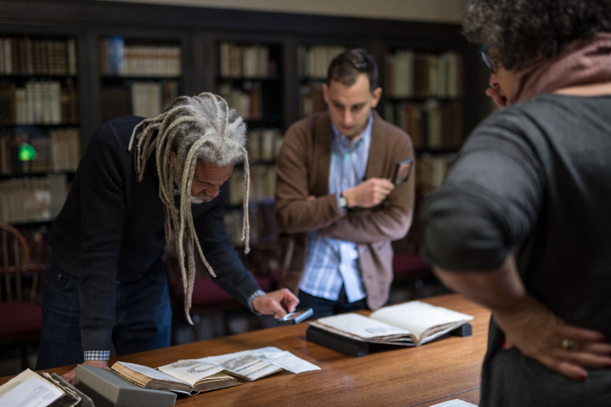
We also did some research of our own. One key insight we uncovered was how researchers interact with materials they don’t just collect objects, they annotate them.
They might select a page from a book and add notes or insights alongside it. Exhibitions follow the same logic: they’re curated collections of objects, each accompanied by contextual annotations that help tell a story.
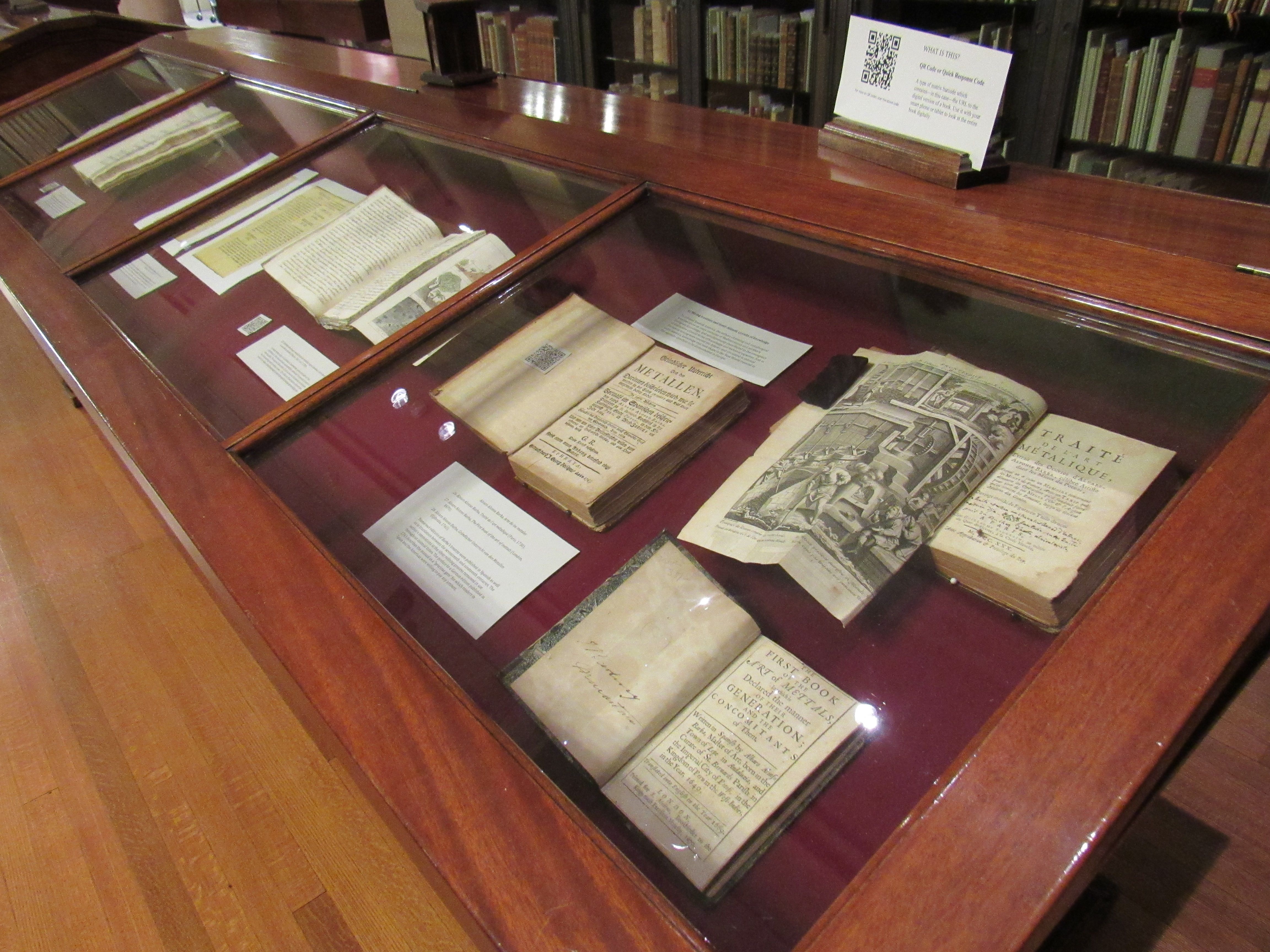
A display case featuring old books and maps with accompanying annotations, forming part of an exhibition.
Reimagining the project page
With a clear vision in mind, I began developing what we called the “exhibition creation mode.” I experimented with different variations where users would switch to a separate mode to create the exhibition.
This early sketch shows the different mode for creating the exhibition with a drag-and-drop system. The functionality was carried over to the final solution.
However, this approach felt redundant as we were essentially showing the same information twice. I realized we didn't need this and the project page itself could become the space for crafting the exhibition.
Keeping the interface clean
To allow for this we needed to do design adjustments to the project page but too many buttons would clutter the UI. Following the “Show me what I need when I need it” principle, I designed hover-based interactions. Hovering between objects reveals an "Add section" button. Hovering over section titles surfaces an edit icon, signaling interactivity.
At that point, I was still designing wireframes, as our visual designer was busy developing a more fitting visual identity. When the new fonts and colors were defined, I started implementing them in my designs.


Iterations of the project page from wireframe to final visual design.
Rethinking how annotations are stored
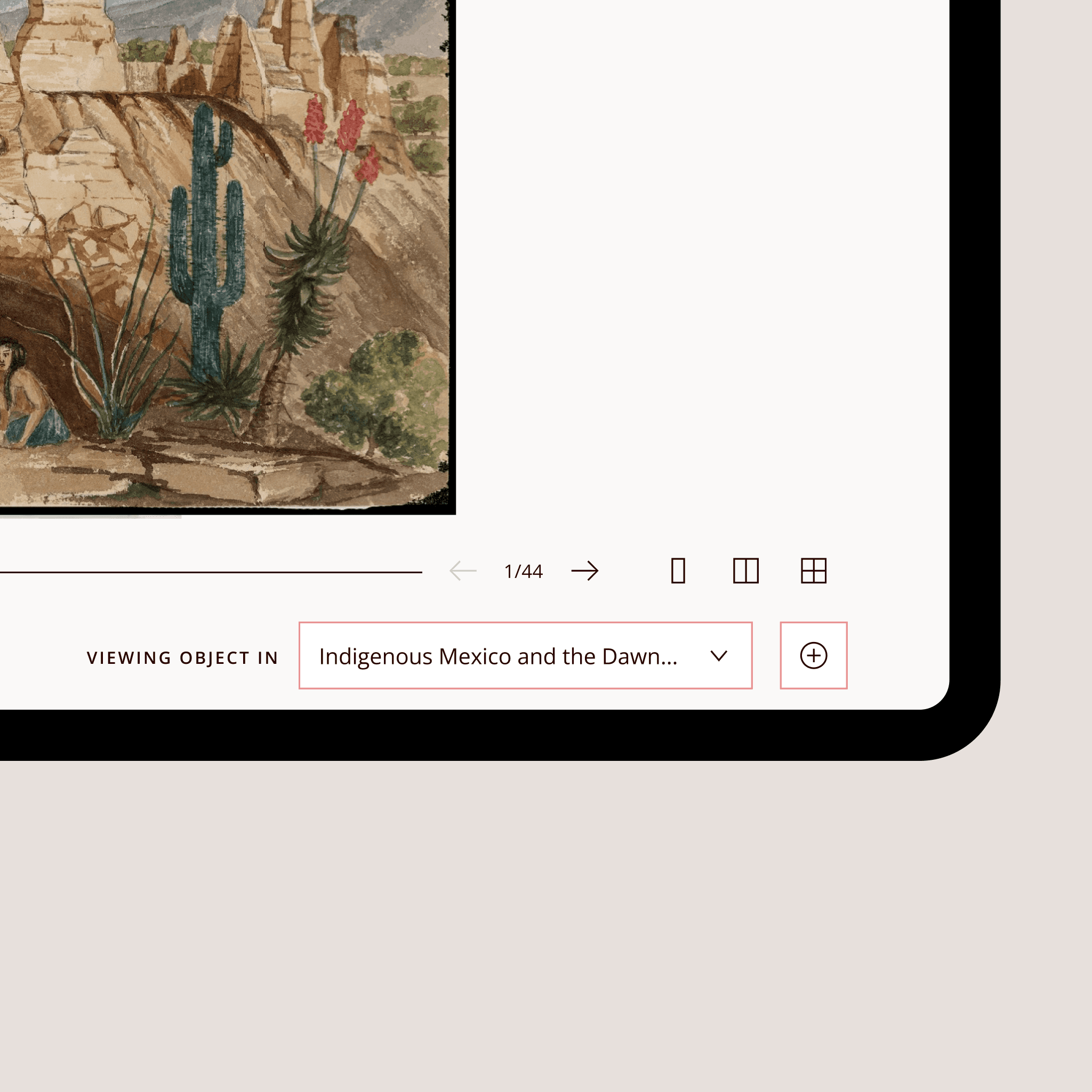
Our developers flagged a potential issue: the way annotations were stored, built in phase 1, wasn’t future-proof. Annotations were tied to individual users, risking loss if a user left a project or the platform. I led a deep-dive discussion with the dev team to fully understand the problem and brainstorm a better approach. Together, we mapped out a solution restructuring annotations to be tied to objects within a project instead.
This change meant that objects needed to be part of a project before they could be annotated. We introduced a project selection modal for this. We also added clear labeling on the object page so users could see in which project they were viewing the instance of that object in.


Defining the publishing flow
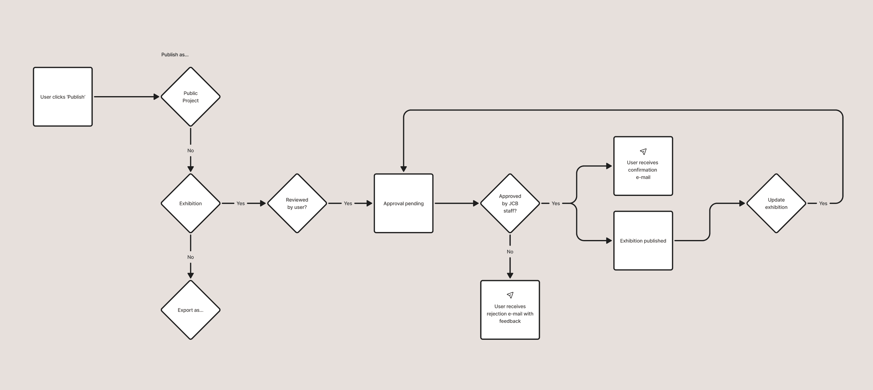
We found out that there was a need for more publishing options than just exhibitions. Researchers wanted to be able to publish their project in a view-only mode. Something that we later called "Public projects'. There was also a need to export a project into different file formats like Excel.
For these multiple publishing options I designed a clear, structured publishing flow. Exhibitions required approval, while public projects could be published instantly. To make the process transparent, I created distinct publishing states: submitted, under review, approved, or rejected, each with clear UX copy guiding users on what to do next.

Making exhibitions work on mobile
Exhibitions needed to be just as clear on mobile as they were on desktop, but space was tight. I had to show both the caption (part of the story) and the object’s details without overwhelming the interface with buttons.
After trying out multiple approaches, I landed on a chevron button that, once expanded, turns into a toggle that allows users to switch between the caption and the details.
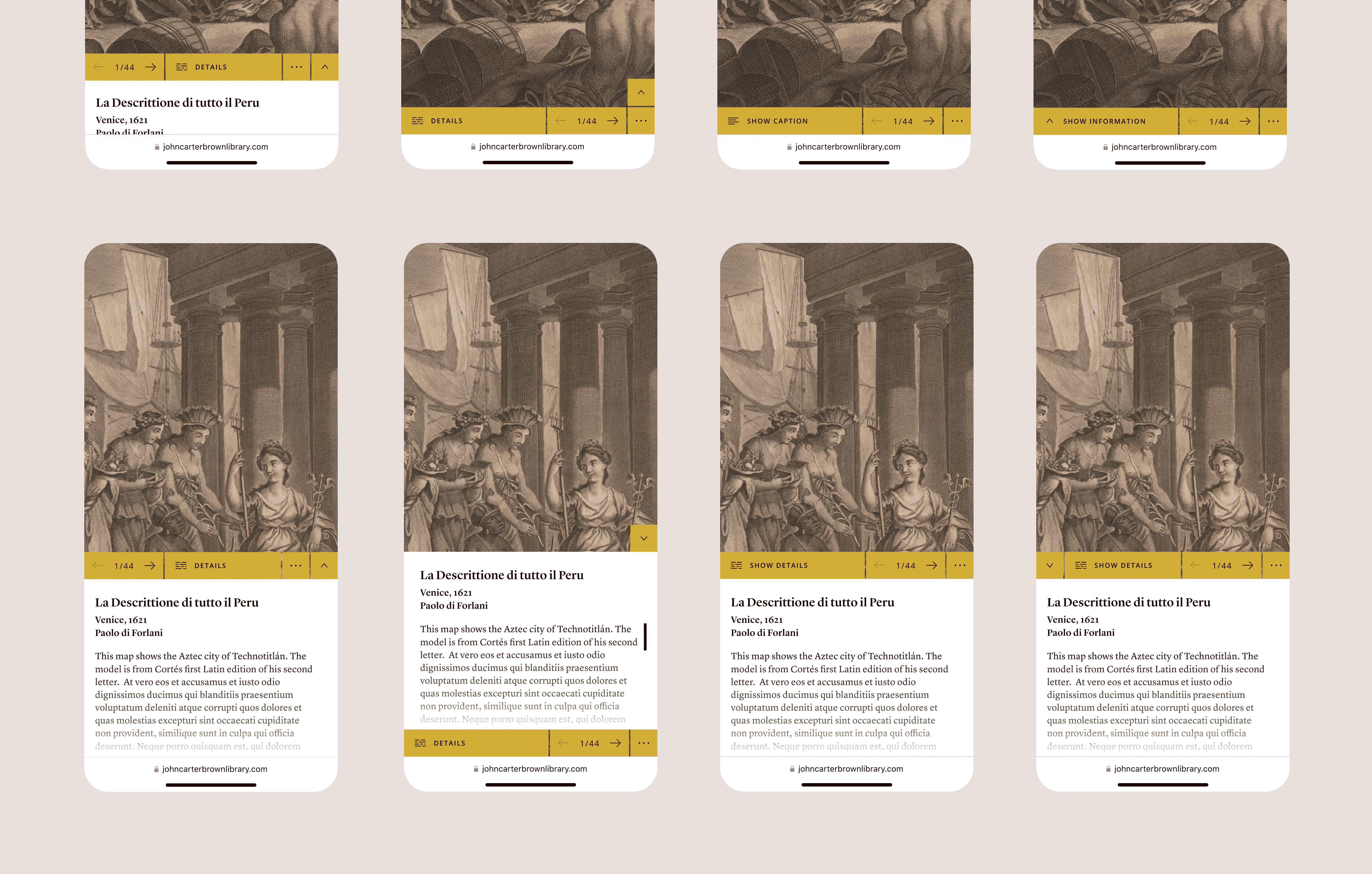

I designed different variations of the caption overlay. The challenge here was too let user open and close the overlay but also toggle between the annotation and details about the object within limited screen real estate.


By designing with the browser UI, I ensured enough space for the image and caption.
Collaborating with the dev team
As the designs took shape, I worked closely with developers to make sure everything translated smoothly into the build. Beyond regular check-ins, I documented key interactions and functionality in detailed dev notes, ensuring a smooth handoff and clear implementation.
Outcomes
What we achieved and where it's headed
Results
More accessible research
Anyone could now explore and create exhibitions, making historical materials more approachable for a broader audience.
Scholarly recognition
The platform received praise from researchers, reinforcing that we had built something truly valuable.
From foundation to fully functional
We took the unfinished groundwork from Phase 1 and transformed it into a complete, working platform. We refined existing features, filled in the gaps, and added essential tools.
“Our readers, supporters, governors, all think that Americana is a turning point to our institution.”
Pedro Germano Leal, Product Owner JCB
Continious improvements
Even after launch, we weren’t done. Two more projects took the platform to the next level:
Object relationships
We built a feature that linked related objects, making it easier for researchers to spot patterns and uncover new connections they might have missed.
Smarter search with AI
Instead of just browsing, users could now ask questions, and the AI would surface answers based on object metadata making deep research faster and more intuitive. Case coming soon!
